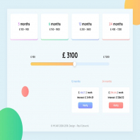
Bank Loan Widget
Vuatailieu.com giúp gì cho bạn?
| Người gửi: | Phí Đình Thảo |
| Ngày đăng: | 30/01/2021 |
| Dung lượng: | 1.10 MB |
| Đánh giá: |
|
| Votes: | 0 |
| Nhận xét: | 0 |
| Lượt xem: | 544 |
| Download: | 0 |
| Loại tài liệu: | Premium |
| Coins: | 20 |
Mô tả:
Widget Loan
1. I assume you have statistics about the amounts of loans. I suggest displaying the most popular loan amount for users who visit your website for the first time.
2. Four blocks at the top of the page are hints for users that show the difference between four types of loans. I think we should not make them clickable. I will explain why.
3. The most important things for a user who borrows a loan are the amount of the loan and monthly payment. Thats why displaying at the same time all proposals for the selected loan amount, a user will be able to compare several offers and opt the most beneficial for him. Thus, the user will not need to check this and memorize all proposals for each of the four types of credit. This makes the process easier for users. Thats why we should not make four blocks clickable.
4. As you probably noticed, each loan offer is associated with each of the four types of loan. I'm talking about colors and the grid.
5. I will summarize. I have reduced the number of steps to opt the most profitable loan for users. The most important thing for us is the convenience for users.
Tags:
bank, calculate, credit, loan, product, ui, userexperience, userinterface, ux, webdesign, widget, web
0
5
4
3
2
1
Chọn đánh giá của bạn
File thiết kế tương tự
Mua lượt tải
Tiết kiệm chi phí
Số ngày hết hạn tính theo gói cao nhất còn giá trị
Với nhiều ưu đãi hấp dẫn


